
Pixies albums are often lauded for their loud/quiet/loud sounds, but their cover art is decidedly spooky/mysterious/surreal. While Charles Thompson (a.k.a. frontman Black Francis) wrote the songs that influenced bands from Nirvana to Spoon, Vaughan Oliver created the look that launched a revolution in graphic design. By the time the Pixies were being scouted by 4AD, Oliver was acting as the in-house designer for the London-based label, turning out artful covers for the Cocteau Twins, Modern English and others. During a 1987 trip to the U.S., Oliver became a de facto A&R man as well, witnessing the Pixies play in Providence, R.I., at the urging of 4AD founder Ivo Watts-Russell.
“They completely knocked me out,” remembers Oliver. “I said to Ivo, ‘Let’s do it.’”
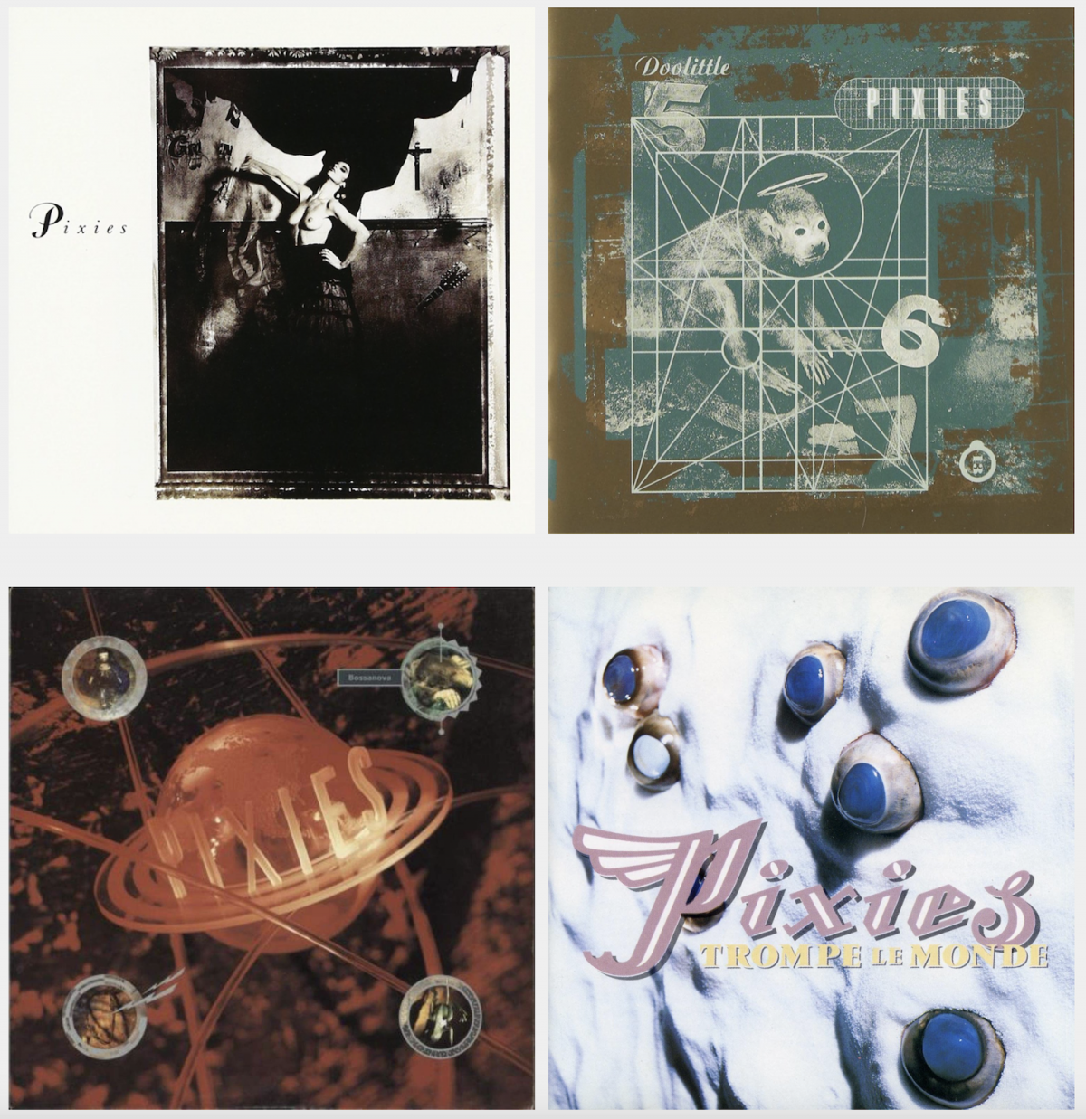
Surfer Rosa (1988)
What I do with every band is listen to the music and read the lyrics and have a conversation with the artist. Charles was very keen on a sense of nudity. We talked about film, and David Lynch was an influence we shared. I think the idea for Surfer Rosa came from Charles singing “Vamos” in Spanish and from his time spent in Puerto Rico as an exchange student. Flamenco dancing is a very proud and traditional exercise, and subverting that puts a decadent perspective on it. The dancer being topless was a nice counterpoint to the traditional sense. That’s (Cocteau Twin) Robin Guthrie’s guitar neck in the photo. The whole thing happened in a pub opposite the 4AD label office because we couldn’t afford a studio.
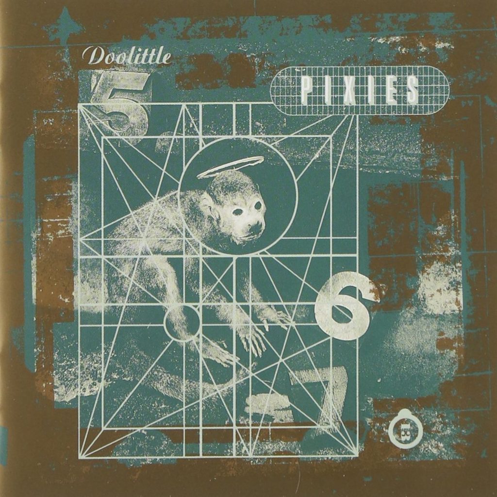
Doolittle (1989)
This cover was based on a simplistic view of the lyrics to “Monkey Gone To Heaven.” Kind of “five, six, seven, monkey gone to heaven.” The song wasn’t about that, but when I described the idea to Charles, he approved. He said, “Vaughan, good pop music is simply mathematical.” That confounded me. I thought it sprang from the heart. And he was saying it was mathematical! Where in the visual arts do we find a comparison? I went back to the Golden Section, which is an idea from the Renaissance. It’s a formulaic way of making paintings by splitting up the area we work with. So I put the mathematical grid over the monkey. Doolittle is my favorite cover; when you go inside the sleeve, you’ve got images that relate to the songs. It’s a very successful package.
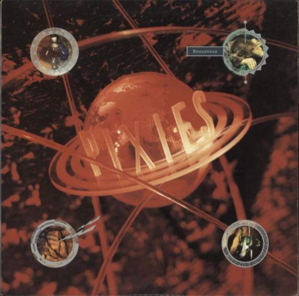
Bossa Nova (1990)
This was our first excursion into color. Everything previously had been sepia-tinted or black-and-white. Even before the music came to me, I was thinking along a “planet Pixies” line. They kind of create their own world. I think Charles actually saw a flying saucer, and his father was very interested in UFOs. So we built this planet out of clear acrylic; it was all pre-computer and done on an artwork board. The whole (visual) effect was an accident. We had a blue-velvet background and a clear planet. In the studio, there was just a slight tinge of pink on this clear acrylic globe due to a red filter on the lights. What we didn’t realize was that when it was shot, the red filter would flood the entire picture. We were technically inept, but it turned out more kitschy than what we saw and we went with it. The four circles in the corners of the cover are references to songs: The doll refers to “Velouria.” The mole is a reference to “Dig For Fire.” There’s a barbed-wire lasso that’s a reference to “Hang Wire.” Then there’s a frog … What the hell was that about?
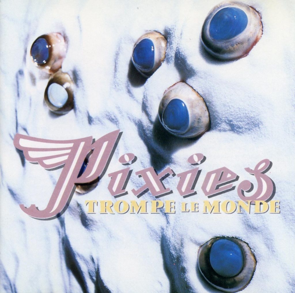
Trompe Le Monde (1991)
The idea was that it was supposed to be the surface of a planet, and (co-designer) Chris Bigg created it with salt. The title comes from trompe l’oeil (“fool the eye”), a technique in interior design where a mural on the wall is the same scale as the room but curtains are painted onto it. I used real bull’s eyes from the butcher; they were very hard to get a hold of because mad cow disease was rife at the time. But Simon Larbalestier, the photographer who shot all the Pixies covers with me, was very persuasive. Initially, we were going to put them in a bowl of water but didn’t realize the eyeballs would go all milky.
—Matthew Fritch