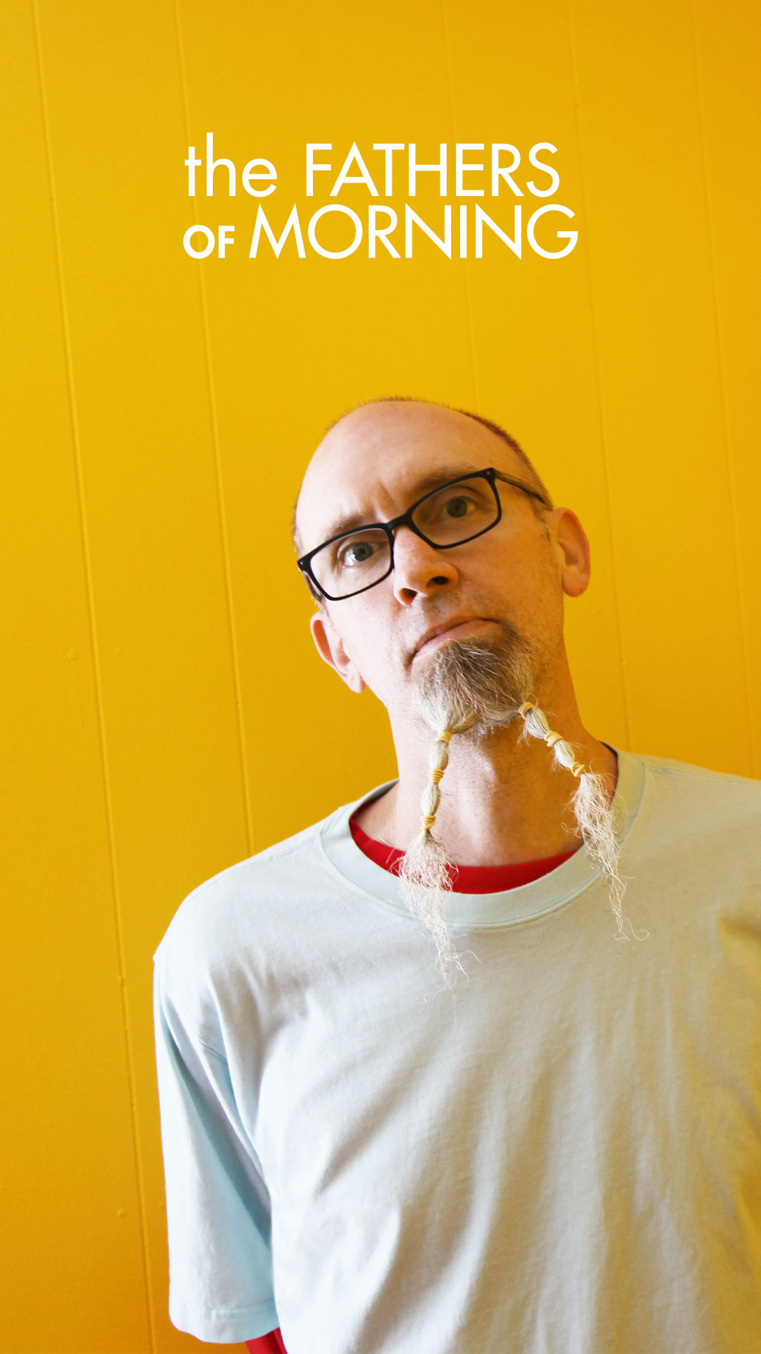
 Kristian Hoffman and Lance Loud met in high school back in the early ’70s in Santa Barbara, Calif. After starring in PBS cinéma-vérité documentary An American Family, they formed the Mumps, moved to New York and shared Max’s and CBGB stages with all the legends of the punk/new-wave explosion of 1976: Television, the Ramones, Talking Heads and Blondie. Hoffman and Loud also had front-row seats for the Mercer Arts Center incubation of the New York Dolls, before that. In our book, that grants you unlimited license to open the floodgates. Fop (Kayo), Hoffman’s latest solo album, is an ornate masterpiece of baroque pop, well worth your attention. Hoffman will be guest editing magnetmagazine.com all week. Read our new Q&A with him.
 Hoffman: If you were a tweener when Sgt Pepper hit American culture in the face like a kaleidoscopic, acid-laced, Groucho Marx cream pie, you know that one never really recovers. Colors never really looked the same after that—album covers turned into bizarre and sometimes ungainly testaments to the imagination with the restraint synapse permanently disabled, and for a while, the renegade mind of indiscriminate youth was saturated with visions of polarized sugar plums, and occasionally infra-red fairies in tapestry-laden dinghies at romantic castles.
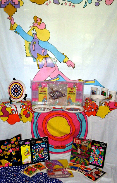
Who leapt into this panty-waisted breach to give this “Lucy In The SkyMall” its corporate branding? Peter Max, that’s who! This sort of branding had been attempted before: Erte (fashion, style, luxury), Saul Bass (graphics, fonts, movie credits). Henry Darger might of branded otherworldly epic battles fought by barely clad gender-indeterminate waifs if he had only lived to exploit his vision made public. Imagine the merch! The obvious and excessively successful branding of a specific graphic vision was, of course, Alphonse Mucha, to whom Max owes a heavy debt, especially in the naked appropriation of the star motif.
But it was Peter Max (I think) who first consciously tried to brand the recently liberated imagination of youth with a big magenta and chartreuse PM. He wasn’t specifically related to music or theater or sculpture or architecture or any particular artistic discipline. He was related to the entire broad spectrum of sight as a sensory experience: How would this look, um, well, everywhere? On cups, on clocks, on sheets and pillowcases, on ashtrays (does anyone remember ashtrays?), on billboards and magazines, on your mind!
And his art was sort of the equivalent of giving your mind a big visual hug. The colors were vibrant but rarely dark, the exaggerated geometry softened the harder edges of pop art by adding convivial, non-threatening characters trotting cheerfully in the abstracted plane of flat perspective, and Max himself embraced a cheery Buddhism-lite with a dash of Swami Gotchanumbah patois that he related through a series of books with heady quotes from his swami of choice like “A spiritual thought has a yellow color” and “Bathe and plunge in the sacred ocean of love.”
I myself cannot resist a Max tchotchke, but it is in my mind where his vision is permanently tattooed to the garbled strains of the Bee Gees’ “Jumbo” and a couple tracks from the Moon’s Without Earth.
Now, who came first: the Fool or the Max?
The Fool and Max dabbled in the same arena and even shared the same fetish for Mucha’s stars, although obviously the Fool never attained a similar super merchandise explosion success. I even have a Peter Max fondue pot!
Simon and Marijke, a.k.a. the Fool, were also more entertainment-oriented: painting the Beatles’ Apple Boutique, the Aquarius Theater, some clothing designs and a handful of fantastic album covers, including the Incredible String Band, Boudewijn De Groot (which may be their masterpiece) and their own erratic and frivolous LP. But where Max was all sophistication, restraint, stylistic deliberation and codification (like Beardsley or Mucha), the Fool was sloppy, exuberant, hippie-ish and never constrained by stylistic trope from one composition to the next, unless it were the exploitation of the rainbow.
The Fool fell somewhere between Mucha, a baby’s attempts at finger painting and Max Ernst. Their art could by highly realized or shockingly clumsy. They dabbled in imagination, but their thoughts were capricious. It’s like they soaked your brain in lumpen Renaissance Faire mead before adding the psychedelics; they were a little soggier, wobblier and much less disciplined. But I dare to posit that their highs were higher.
Keith Haring was, in my mind at least, the Peter Max of the ’80s, but his vision was so much harsher. His use of color was abrupt and assaultive. Primal. I know he exploited a cave-painting trope on his incessant refinement of his comic-book conventions, a whittling down to the most minimal use of representation to get his figures and visions across. It was wild and fun to see everywhere—mugs and shower curtains and subway posters—but it was, at heart, distancing. Chilly. It didn’t say, “Float away on the fluffy clouds of a Beatle hangover to the land where dancers waltz with the milky way! “ It said, “Boogie in this time of loss.”
Of course, the minute Max turned away from being the Martha Stewart of acid culture and tried to reconfigure himself as a legitimate “fine artist” sometime in the mid-’70s, he suddenly became absolutely uncompelling. His reach for legitimacy destroyed what made his art truly legitimate. Who cares about a Peter Max brush stroke? And how does this happen? Especially since exactly the opposite happened to Mucha, who spent most of his career defining art-nouveau stye with his portraits of Sarah Bernhardt and designs for silverware that looked like they had been saved from a compost heap, but who ended his career painting the magnificent and eerie Slav Epic and designing Czech currency—the ultimate in branding!
But if there were ever a pillow case that could invoke the dream of the technicolor epiphany of optimism, activism and solipsism that was the best of the ’60s to make truly communal art out of calculatedly corporate adventurism, it was Max, Peter.
Video after the jump.
http://www.youtube.com/watch?v=punS9XAjMJ8


