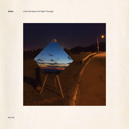
Matthew Gengler: For a long time, Aloha has sought artists for album covers and graphic designers for layout. It’s no shot at designers, my favorite covers feature exceptional layout and typography. But the art is an integral part of that. With the opportunity to select art for the cover of a new record, we first look for the artist.
It is not difficult to find other bands who follow this similar idea. Sonic Youth regularly featured well-known artists, including the Gerhard Richter, Richards Kern and Prince throughout their discography. Yo La Tengo used the work of Dario Robleto on the cover of their Popular Songs, a cassette tape composed, according to the artist’s statement that the band included in the liner notes, of an increasingly dire list of constituent parts. You can even find the earnest Swiss artist Roman Signer on the cover of Gastr del Sol’s Upgrade and Afterlife. His image of water exploding from a pair of boots as if by magic, is iconic.
But thanks in part to the popularity of these bands, these works have become symbols for something unconnected to the meaning of the object. What then does it mean to strip the art from the meaning, or really, the art from the artist, and the oeuvre of the artist? In some ways, the cover becomes the idea of the record. The visual metaphor for the thing. Is this OK?
This question bothered me as we arranged for the work of artist Lauren Yeager to appear on the cover of our record. Her work is conceptual in nature and especially thoughtful, but not obtuse. Her photograph of a sunset reflected in a mirror is one of a series of photographs I saw in an exhibition last year. I absolutely loved it when I saw it, and after looking at her work, I wanted people to see what she does. But I’m torn. I don’t know how much we help by doing this.
I work in a museum as a reference librarian. The metrics of museums are acutely familiar to me. Most museum visitors spend seconds in front of each painting in the galleries. The labels, which curators spend hours painstakingly composing, are glanced at in passing, unread. Is it just as easy then to say, the album cover affords the artwork something more than a momentary gaze? I can’t say if it’s that clear. In our case, it seems unlikely that the album cover of our record will somehow become a generational touchstone. There are only so many opportunities for late-30s dudes (OK, so I’m 42, whatever) that make experimental prog pop to make a dent.
That said, some of my favorite records, both visually and musically, fall in the ECM catalog. I’ve always loved Gateway’s self-titled debut and Gary Burton’s Ring. Underappreciated albums in their time and likely after as well. Both albums feature covers that are idiosyncratically ECM. Art floating in a frame with the band’s name. This same aesthetic found its way into covers for Genesis and other ’80s bands. But it really defined the ECM thing for many years. If there was a name with too many consonants and clean text, it was probably ECM. Now years after these records were released, I continue to look at these images, associating the art, the text, the design with everything that I like about the music, and maybe I feel a little better. I haven’t exactly stopped long enough to take in the meaning of the art work, but I’ve internalized it.


